Type Speciment


Overview
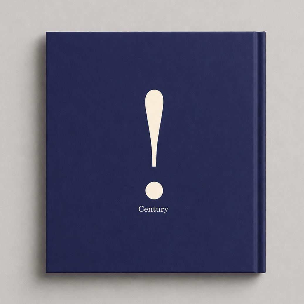
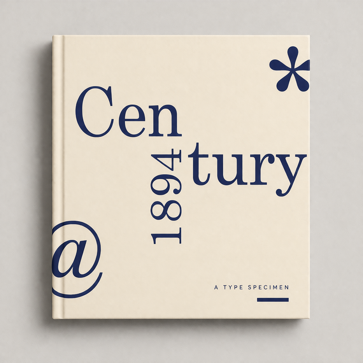
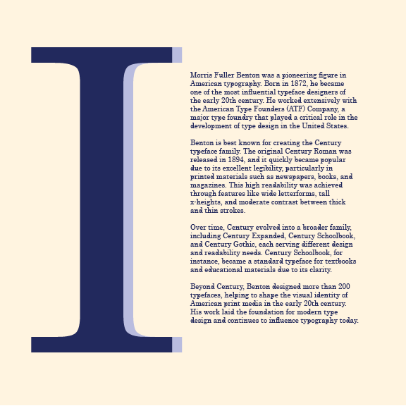
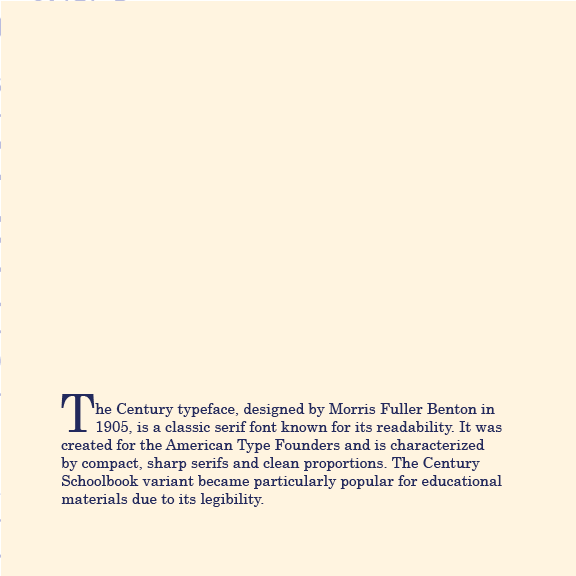
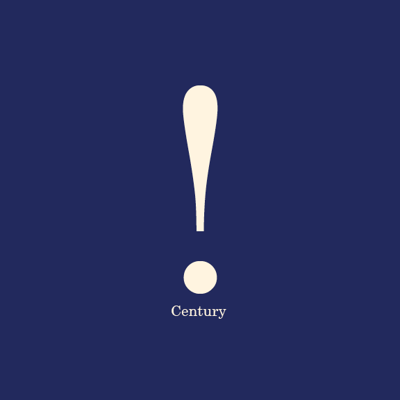
This project is a type specimen booklet centered on the Century typeface, designed to transform a traditionally static subject into a modern, engaging editorial experience. It highlights the typeface’s history, structure, and versatility through strong layout and typography.
My approach
I combined research, sketching, and layout exploration to develop a structured grid system that guided the entire booklet. This system became the foundation for organizing content, allowing me to create a clear visual hierarchy and maintain consistency across all spreads.
By carefully considering spacing, alignment, and scale, I was able to balance readability with more expressive typographic moments. This approach ensured that the booklet not only communicated information effectively but also felt visually engaging and cohesive from beginning to end.
Big Ideas, Real Impact.
Typography as storytelling
Blend of classic + modern design
Type is both functional and expressive
The project shows how typography alone can drive visual engagement and communicate information effectively, positioning Century as a timeless yet relevant typeface.
Color Studies
Navy, beige, and blue-violet create contrast and a modern, cohesive look.
Composition
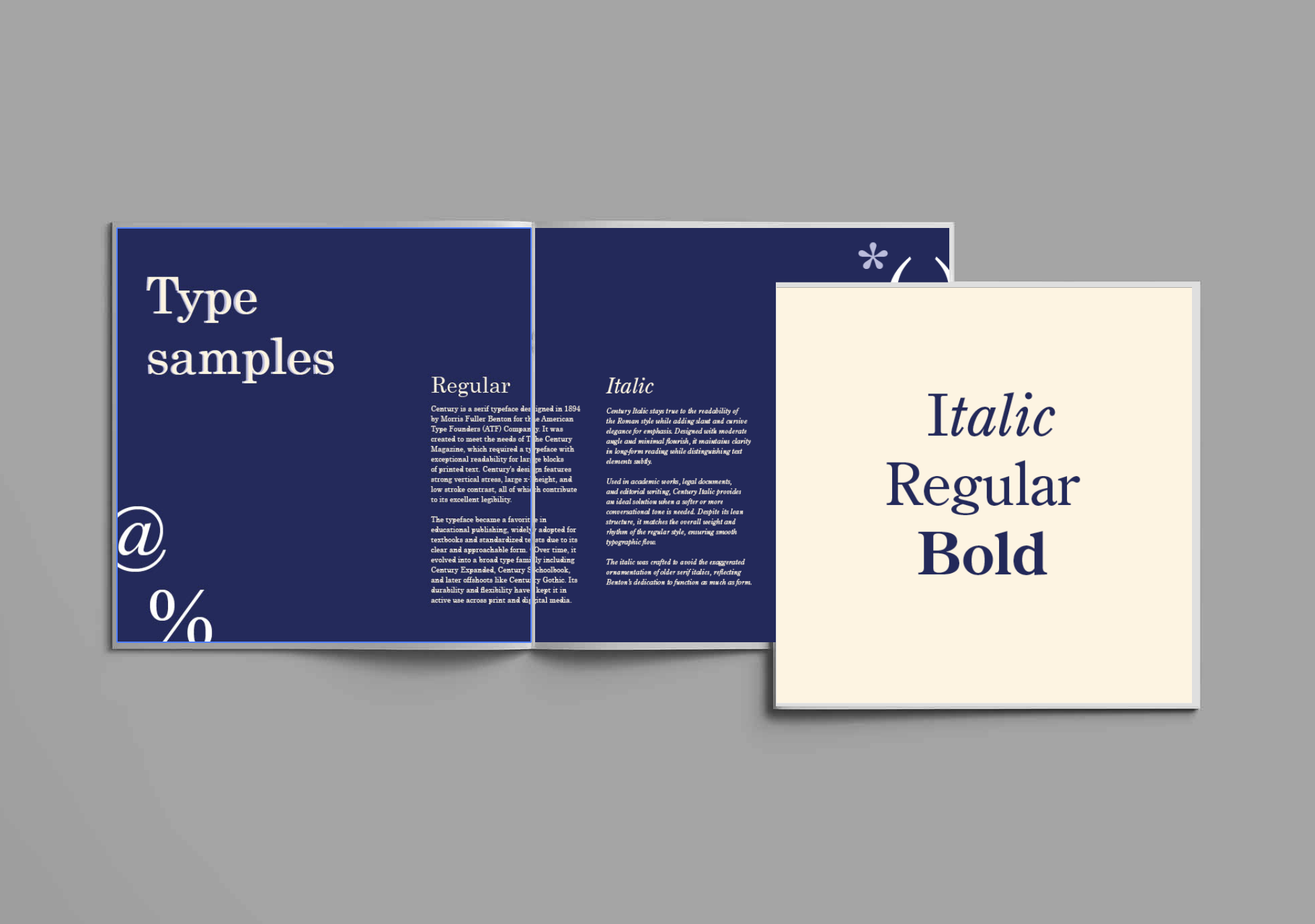
A grid system creates structure, hierarchy, and visual balance.
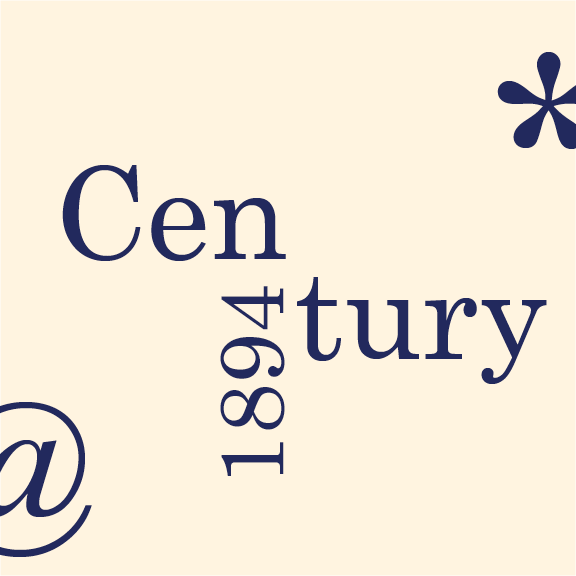
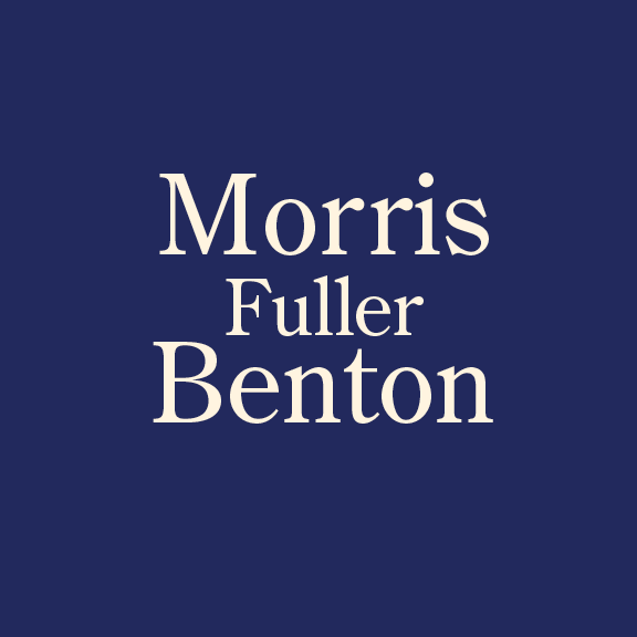
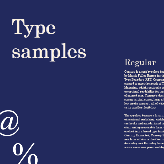
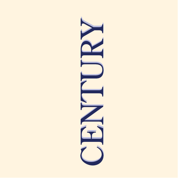
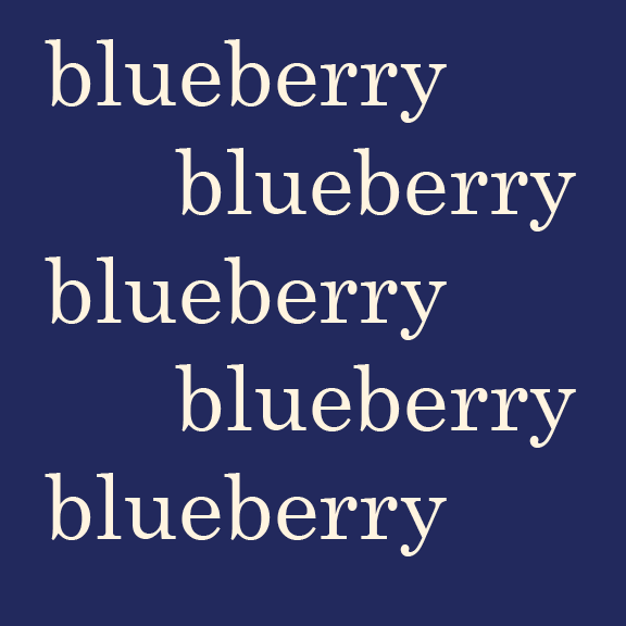
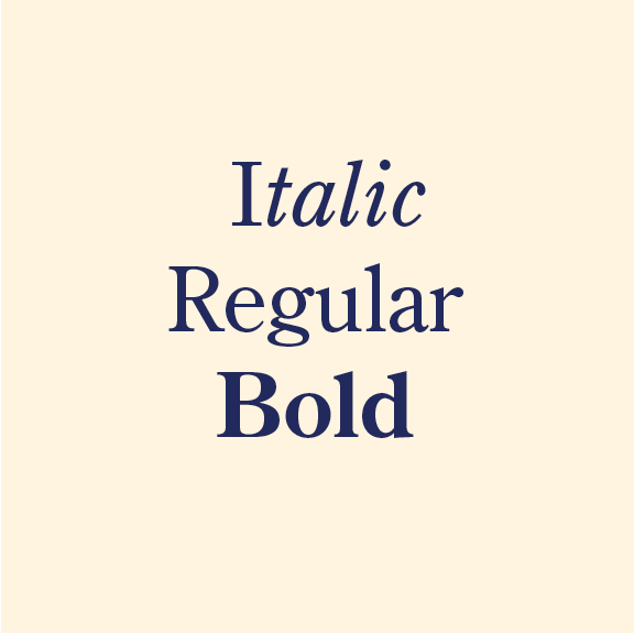
Typeface
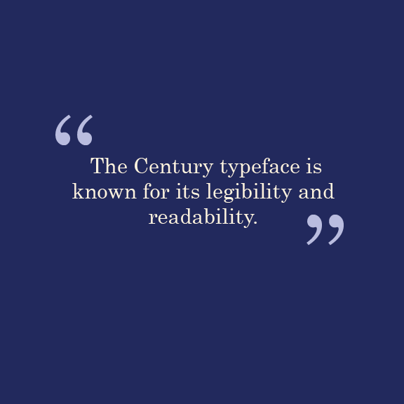
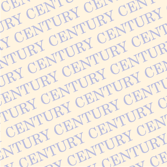
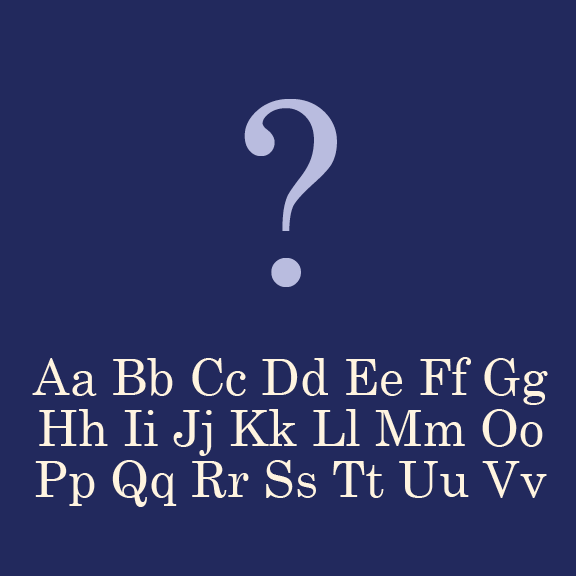
Century is used in multiple styles to show readability and versatility.


Conclusion
This project reinforced my ability to use typography and layout as the primary drivers of visual communication. By working within a structured grid system while still exploring expressive compositions, I learned how to balance clarity with creativity. It also deepened my understanding of how type can shape hierarchy, guide the reader, and tell a story without relying on imagery.
Overall, this experience strengthened my confidence in editorial design and showed how thoughtful design decisions can transform traditional content into something modern and engaging.