Bigelow Rebranding
ROLE
Designer
DURATION
Spring 2025
TOOLS
Adobe Illustrator
OVERVIEW
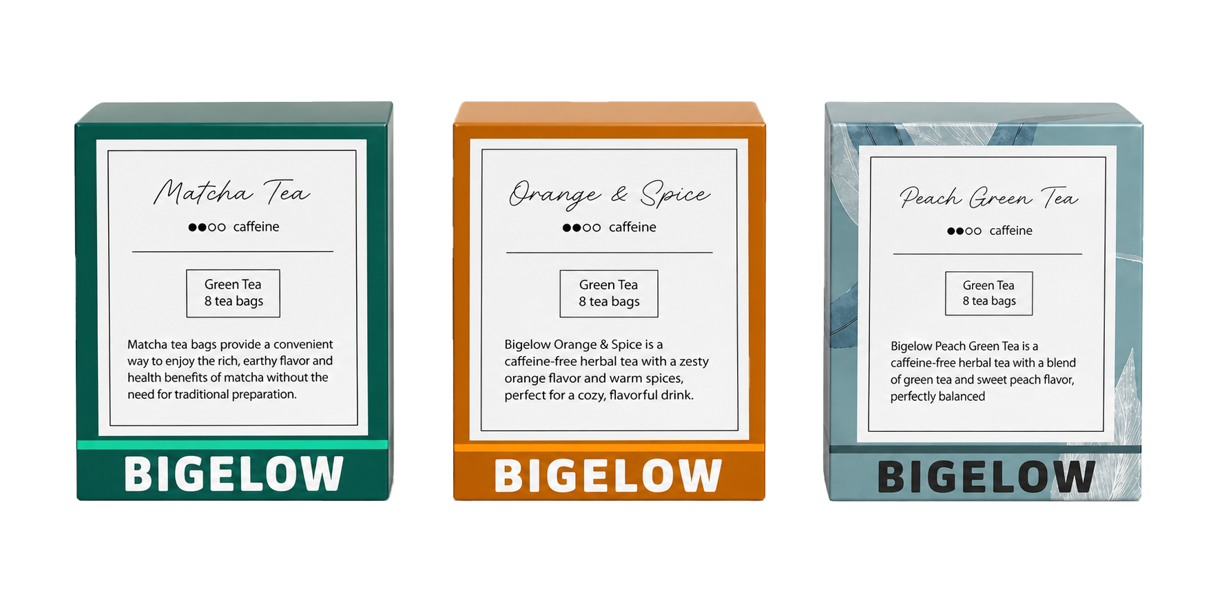
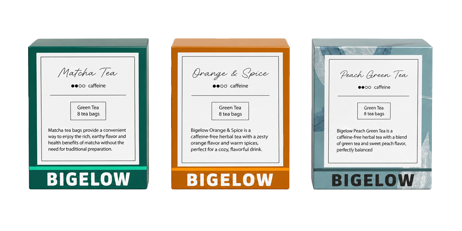
This project focused on redesigning the packaging for Bigelow, a well-established tea brand, with the goal of creating a more modern and visually appealing identity. The redesign reimagines the brand’s packaging system across multiple flavors, including Matcha, Orange & Spice, and Peach Green Tea.
The final outcome is a cohesive packaging system that highlights Bigelow’s heritage while introducing a cleaner, more contemporary look that feels relevant to today’s audience.
MY APPROACH
I approached this project by balancing brand heritage with modern design. Bigelow has a strong legacy, so instead of completely changing its identity, I focused on refining and elevating it.
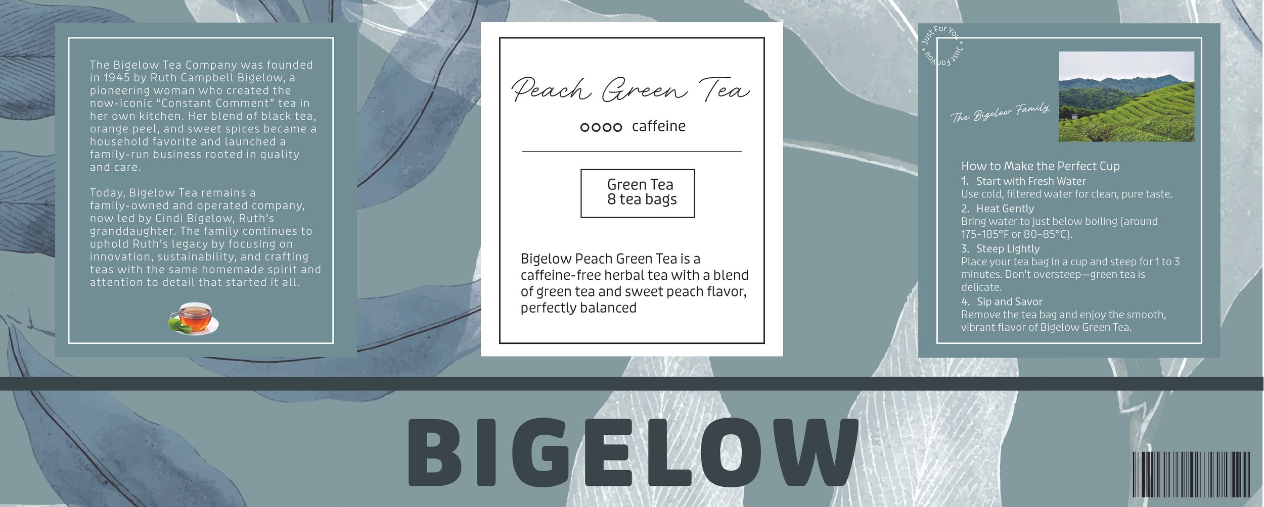
I simplified the overall layout, introduced a softer and more minimal color palette, and emphasized natural elements like leaves and textures to reflect the product itself. At the same time, I made sure to include important information, like brewing instructions and brand storytelling, to keep the packaging functional and informative.
The goal was to create something that feels clean, calm, and intentional, while still standing out on the shelf.
PROBLEM
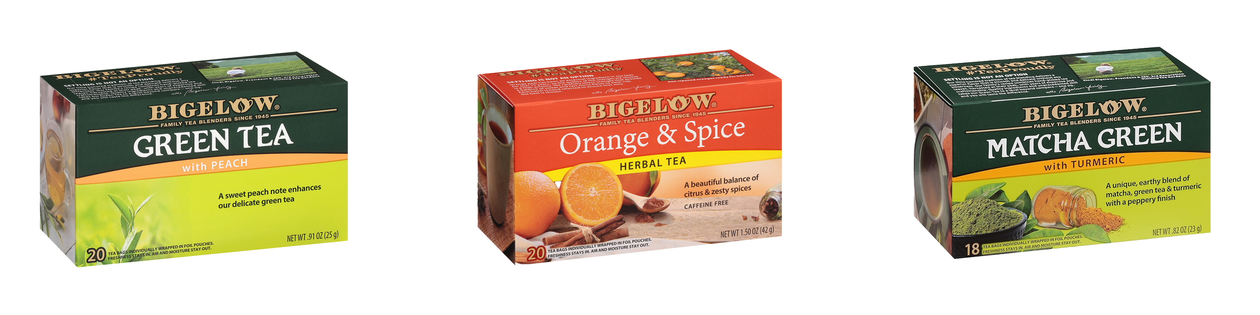
Bigelow’s existing packaging felt outdated and visually busy, making it less appealing compared to newer tea brands on the market.
It lacked a strong connection to modern design trends and didn’t fully communicate the brand’s natural and premium qualities. Additionally, the packaging didn’t strongly attract younger consumers or those drawn to more aesthetic, lifestyle-driven products.
SOLUTION
I redesigned the packaging system to be more minimal, cohesive, and visually engaging.
Each flavor was given its own color palette while maintaining a consistent structure across all designs. I introduced:
A cleaner front layout with a clear hierarchy
A modernized logo with a stronger leaf element
Soft botanical visuals to emphasize natural ingredients
Organized side panels with brand story and brewing instructions
LOGO REDESIGN
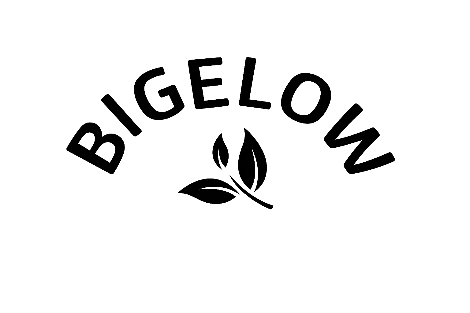
I redesigned the Bigelow logo to create a more modern and approachable identity while still reflecting its natural roots. By simplifying key elements, the logo feels cleaner and more aligned with today’s wellness-focused audience.
Simplified, modern typography
Curved “Bigelow” wordmark for a softer feel
Minimal leaf icon to emphasize nature
Clean, versatile design across packaging


Color Studies
Soft blue-gray for a calm, clean feel
White space keeps it fresh and minimal
Hints of green suggest natural ingredients

Composition
Centered, balanced layout
Clear hierarchy from brand to details
Grid keeps everything organized

Typeface
Bold sans-serif for the logo
Simple, readable body text
Clear hierarchy for easy scanning
CONCLUSION
This project reinforced my ability to use typography and layout as the primary drivers of visual communication. By working within a structured grid system while still exploring expressive compositions, I learned how to balance clarity with creativity. It also deepened my understanding of how type can shape hierarchy, guide the reader, and tell a story without relying on imagery.
Overall, this experience strengthened my confidence in editorial design and showed how thoughtful design decisions can transform traditional content into something modern and engaging.