The Psychology of Color in Sports Branding
Many people overlook how powerful the psychology of color is in sports branding and how deeply it influences fan emotion, team identity, and long-term loyalty. Colors are often assumed to be chosen randomly or based on preference, but in reality, they are strategic decisions rooted in psychology and brand positioning.
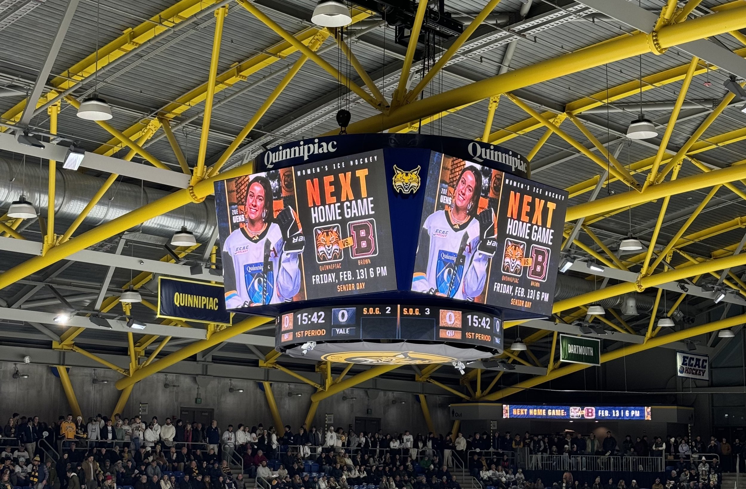
As both a designer and an athlete, I’ve seen firsthand how impactful color can be, not just in a logo, but across uniforms, stadium environments, and social media graphics. When I walk into a game and see an entire section dressed in one unified team color, the energy is immediate and undeniable, even before the first whistle blows. That emotional reaction isn’t random, it’s the result of intentional design choices that use color to create connection, unity, and identity.
Team Identity Starts with Color
Before you recognize a logo, you recognize a color combination. Certain colors instantly communicate emotion and personality:
Red → intensity, passion, dominance, energy
Blue → trust, stability, loyalty, tradition
Black → power, authority, sophistication
Yellow → optimism, energy, visibility
Make it stand out
According to research on color psychology in sports, teams often choose colors strategically to shape perception. Red, for example, has been linked to heightened excitement and competitive aggression. Blue builds feelings of trust and long-term loyalty. These choices are rarely random, they are brand decisions rooted in psychology.
In sports branding, color becomes shorthand for personality. It tells fans what a team stands for before a single word is spoken. As someone who has worn a team uniform for years, I can say that putting on those colors shifts your mindset. You feel more focused and connected to your team.
That’s not random. That’s color psychology working.
Color Psychology and Fan Connection
The psychology of color in sports branding extends far beyond the players, it directly shapes the fan experience. When fans wear team colors, they feel part of something. They’re saying, “This is my team.” That visual language builds community in stadiums, on campus, and across social media. It transforms thousands of individuals into one.
As a student-athlete, there is nothing more powerful than entering a stadium and seeing the stands filled with your team’s colors. It builds confidence. It creates momentum. It applies pressure before the first whistle even blows. Color becomes emotional fuel.
What Team Colors Stand Out to Me
Certain team colors stand out to me because of how they make me feel, both as an athlete and as a designer.
I’ve always been drawn to bold, high-contrast combinations, especially deep navy with a bright accent. It feels competitive but controlled. Black-based uniforms also stand out to me, they create an instant sense of power and intimidation before the game even starts. As an athlete, you feel that energy shift. As a designer, you recognize it’s intentional.
I also notice how well these colors translate digitally. Strong sports branding has to work everywhere, on the field and on social media. If the colors don’t hold up across platforms, the brand feels weaker.
Color isn’t just aesthetic. It’s also a strategy.