How Game-Day Posters Create Hype Before the First Whistle
Make it stand out
Whatever it is, the way you tell your story online can make all the difference.
As both a Division I athlete and a sports design intern, I’ve learned that game-day hype doesn’t start on the field; it starts on the screen.
During my internship in athletics communications, I remember finalizing a poster before a big matchup and thinking, This is the first thing our players will see when they wake up. That changed how I designed it.
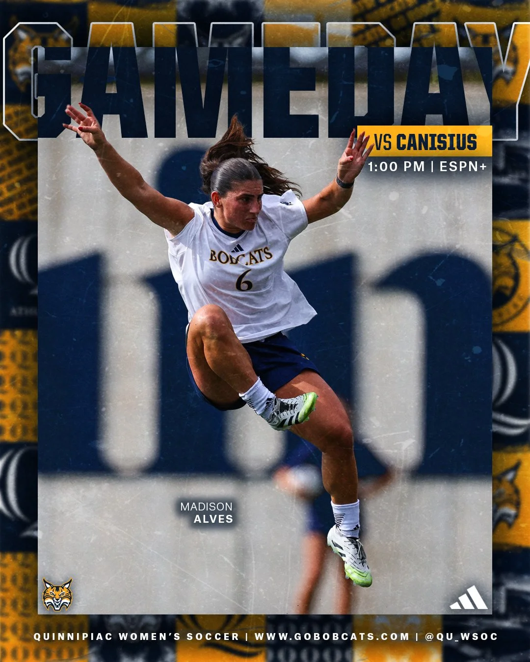
When I created the Women’s Soccer Semifinal game-day post, I knew I had to use the photo I took of the winning overtime goal. It wasn’t just an action shot. This image captured the emotion of the moment, and I know this would hype up the players.
Typography: Setting the Intensity
Typography controls the volume of the poster.
Bold, condensed fonts create urgency and power. A heavy sans-serif can feel aggressive and competitive, while a slightly italicized font adds motion, like the text itself is moving forward. I also think a lot about scale. The team’s name or “GAME DAY” usually dominates the composition because that’s the emotional trigger.
Hierarchy is everything.
Headline = emotion
Subheadline = context
Details = logistics
If someone scrolls past in two seconds, they should still feel the matchup. During my internship, I realized typography isn’t decoration, it’s a strategic tool that communicates confidence before the game.
Imagery: Turning Still Photos into Energy
Imagery is where emotion lives.
That’s why, for the Women’s Soccer Semifinal post, I chose the photo I took of the winning overtime goal. It wasn’t just action, it captured the adrenaline and intensity of that exact moment. As an athlete, I know what that energy feels like in my body, and when I design, I try to reflect that same tension and excitement visually. If the image doesn’t make you feel something, it’s not the right one.
Layout: Controlling the Chaos
Sports are chaotic. Posters shouldn’t be.
Layout is about controlled energy. Strong alignment, intentional negative space, and clear focal points keep the design powerful instead of overwhelming. I often center key elements to create dominance, or use diagonal compositions to imply movement and momentum.
How Players Perceive Design
Before I wrote this blog, I did some research and stumbled upon a blog about game visual designs related to psychology. I started thinking about how visuals influence motivation. The article explained how design elements can trigger emotional responses and increase engagement before interaction even happens. That applies directly to sports posters.
When players see bold typography, dramatic imagery, and structured layouts, it signals importance. That perception can elevate focus and intensity before warm-ups even start. Design becomes part of the mental preparation process.
Game-day posters are more than graphics. They are the emotional warm-up.
As someone who has competed in the game and designed for it, I see it as motivation before the first whistle blows. Game-day posters also build connections. They remind players, coaches, and fans that they are part of something bigger than just one match. A well-designed poster can capture team identity, pride, and momentum all at once. Whether I’m on the field or behind the screen, the goal is the same: create energy, build confidence, and set the tone.