Typography:
Calendar Design
ROLE
Designer
DURATION
Fall 2025
TOOLS
Adobe InDesign
OVERVIEW
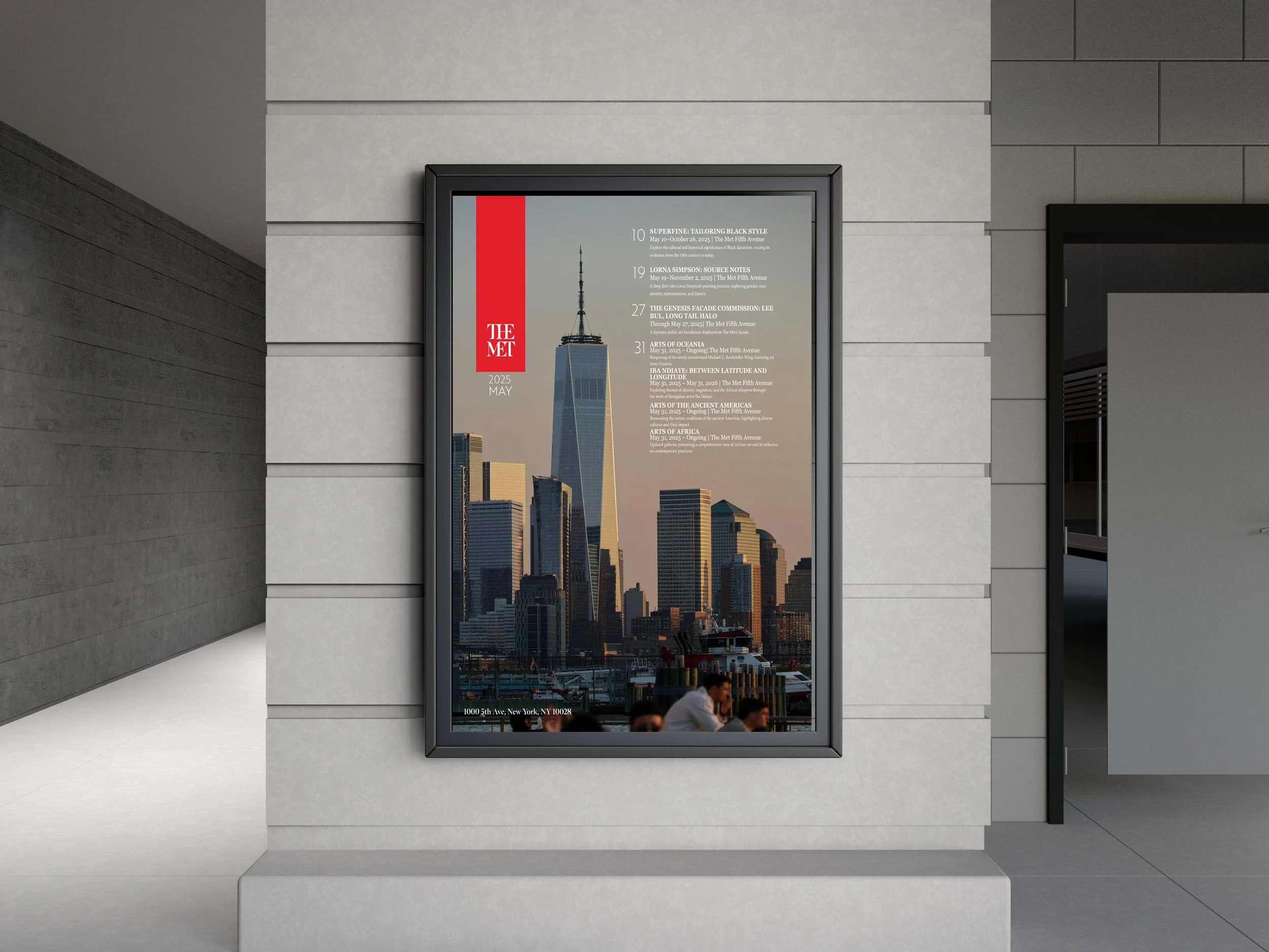
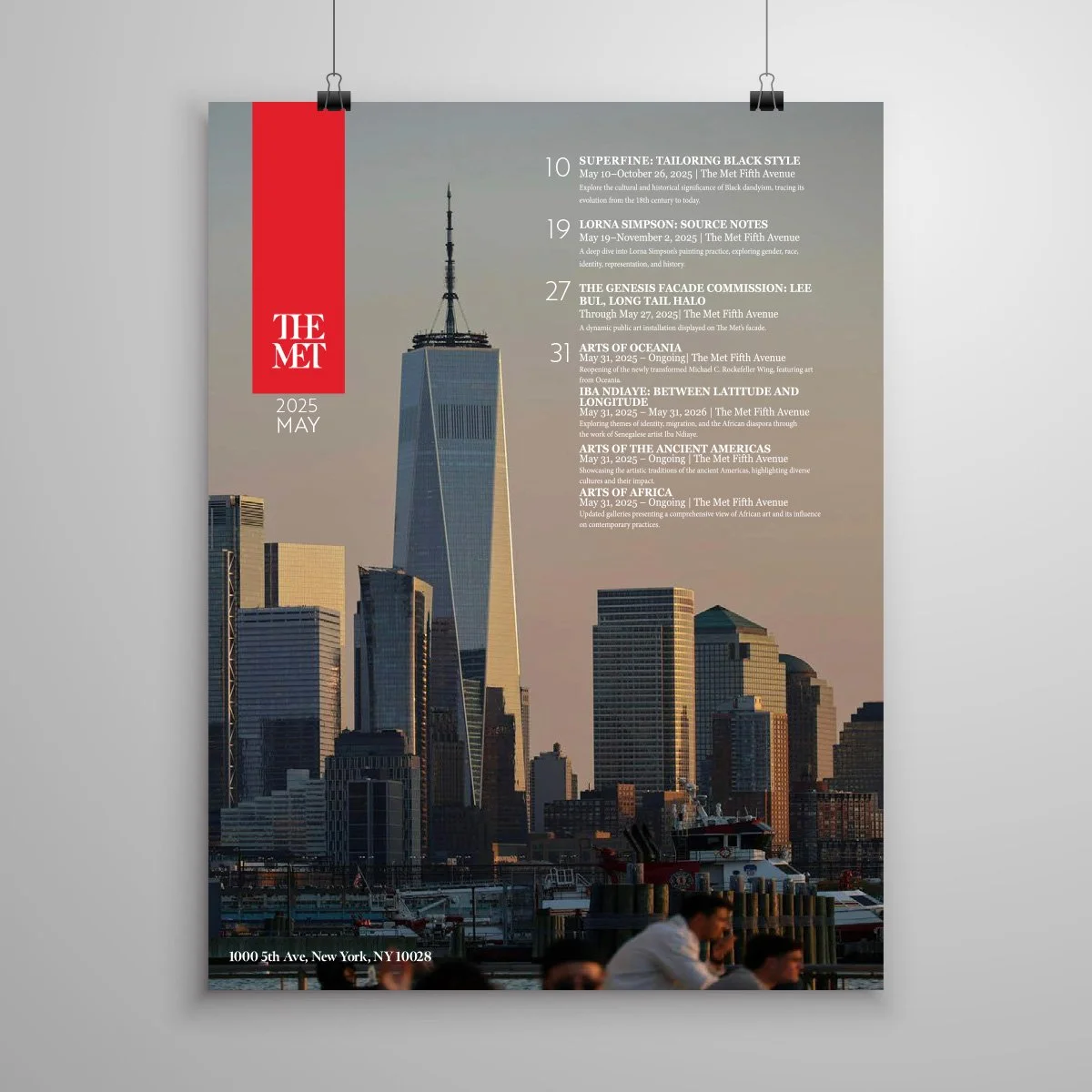
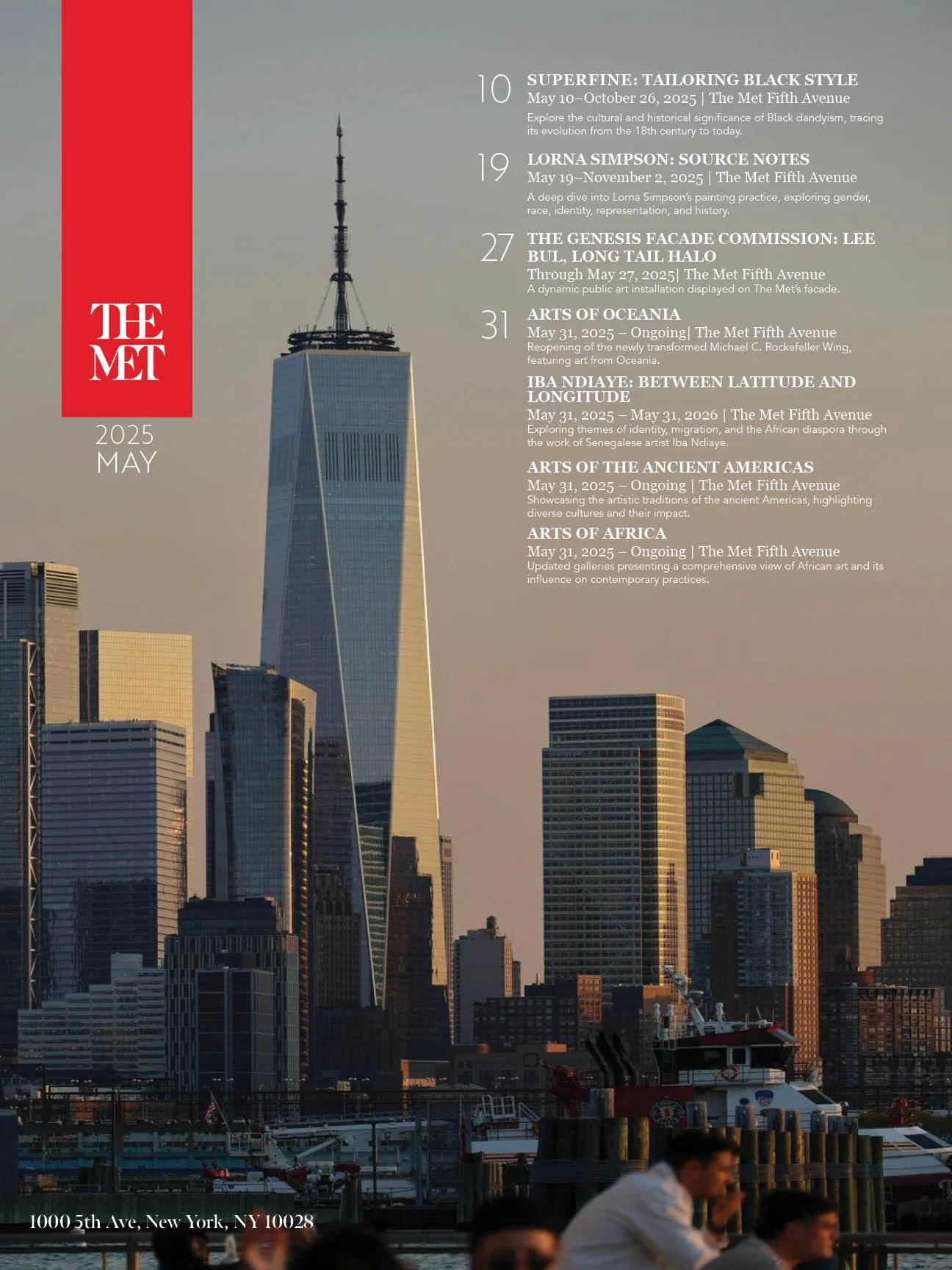
This project is a calendar poster inspired by The Met’s May events, combining editorial design with visual storytelling. The goal was to present a large amount of information in a way that feels clear, engaging, and visually refined, while connecting the museum to the energy of New York City. The final piece balances structured event details with a strong photographic background to create both function and atmosphere.
MY APPROACH
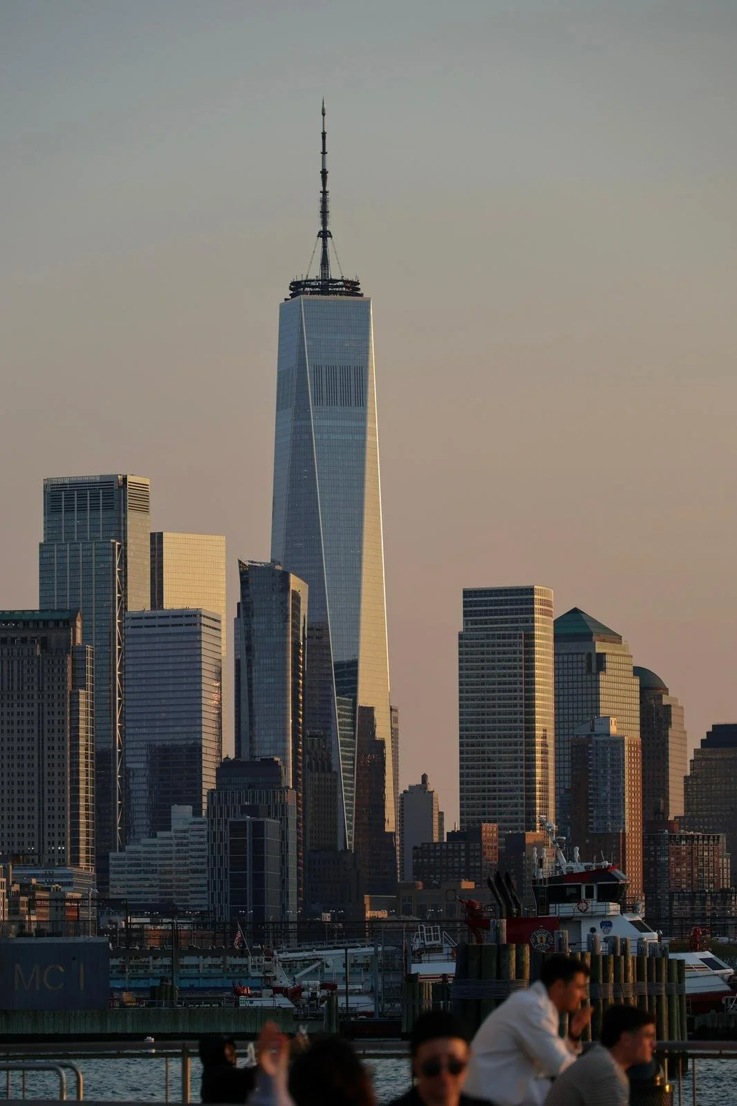
I started by exploring multiple directions through sketches and compositions, testing how image, branding, and typography could interact. I used my own photography to ground the design in a real NYC context, then built the layout around clarity and hierarchy.
Through feedback, I refined spacing, alignment, and text placement—focusing on making the information easy to scan while still maintaining a strong visual presence. The final design blends editorial structure with a more expressive, image-driven composition.
BIG IDEAS, REAL IMPACT
The design connects The Met to New York City through imagery, creating a sense of place while reinforcing the museum’s identity. By organizing dense information into a clear hierarchy, the poster remains easy to navigate without losing visual interest. The use of The Met’s signature red strengthens brand recognition and draws attention to key elements.
Overall, the poster captures attention from a distance and delivers information effectively up close, making it both visually engaging and functional.

Color Studies
The Met’s red adds contrast and draws attention to key elements.
Composition
A vertical layout with a strong central image creates focus, while the text is structured along one side for easy scanning and balance.

Typeface
A serif and sans-serif pairing creates contrast while keeping the information clean and readable.
CONCLUSION
This project highlights my ability to merge design with communication, taking complex information and transforming it into a clear, engaging visual system. Throughout the process, I learned the importance of iteration and feedback, especially when working with layouts that require both strong aesthetics and high functionality.
By refining hierarchy, spacing, and alignment, I was able to improve not just how the design looks, but how it works. The outcome reflects a balance between creativity and clarity, showing how thoughtful design decisions can guide a viewer’s experience. This project also strengthened my understanding of branding, composition, and editorial design, all of which are key to creating work that feels both purposeful and impactful.